Corporate Identity
A practical guide to using ASEC’s logo, colours and visual identity consistently.
Use the identity clearly, consistently and with purpose.
Corporate Identity is not only about making things look neat. It helps our audience recognise ASEC quickly and experience the same standard across materials, videos, events and communication.
Use the correct logo version
The full colour logo is the preferred option. Black and gold variants require approval from the Marketing team.
Full colour logo
Use this as the default option whenever visibility and background allow.
White logo
Use on dark or image backgrounds where the full colour logo is not clear.
Black logo
Use only under special circumstances with prior approval.
Gold logo
Use only under special circumstances with prior approval.
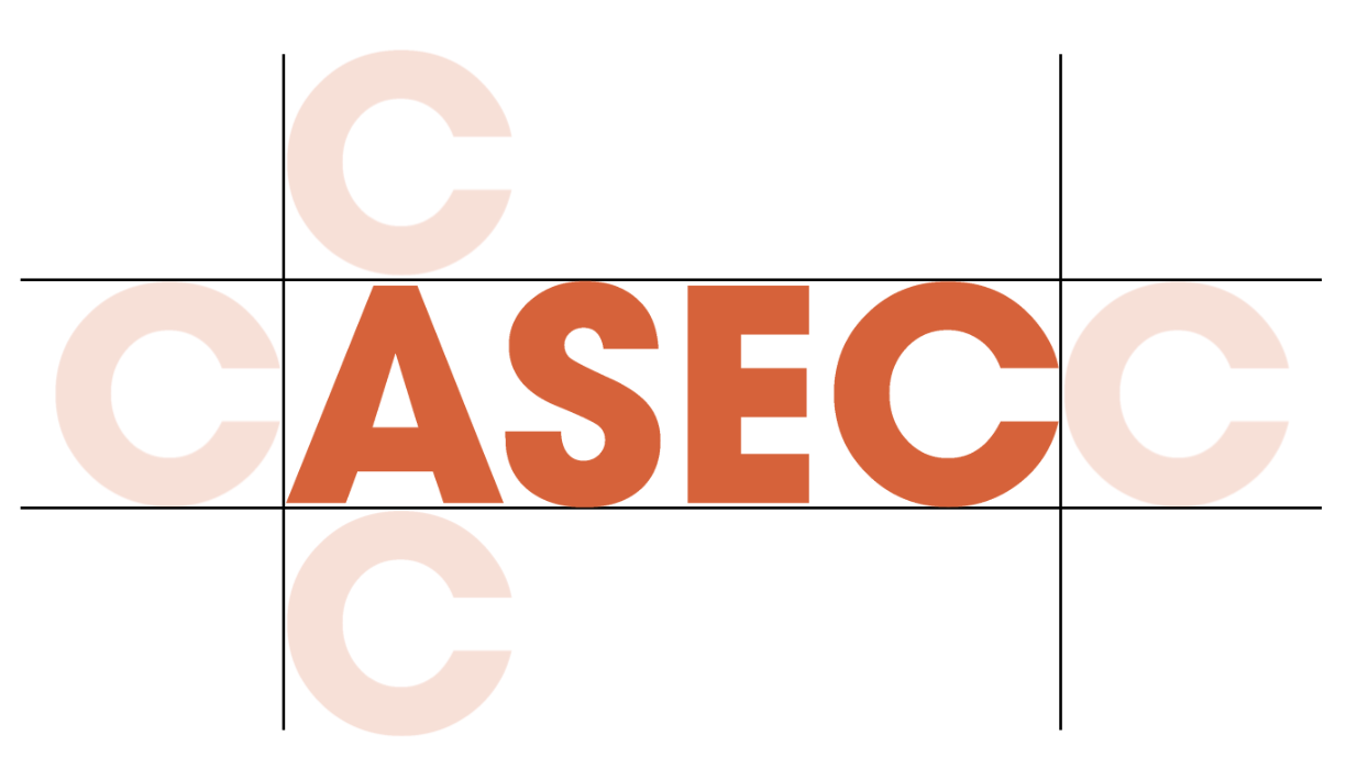
Give the logo enough space
Maintain minimum clear space around the logo. Use the height or width of the letter C in the logo as the minimum spacing guide.
Clear space guide
The logo should have enough breathing room and should not be squeezed by text, photos, borders or other logos.
Place the logo where people expect to see it
The ASEC logo is generally placed at the top left of communication materials. For video content, the logo should appear in the outro to avoid blocking key visual elements.
Single logo material
Multiple logo material
Video logo outro
Before sharing our logo externally
Our logo represents ASEC’s public support and reputation. Always obtain approval from the Marketing Department before sharing it with external parties or using it on merchandise.
Who
Who are we sharing the logo with, and what is their relationship with ASEC?
Purpose
What is the business purpose, and where will the logo be used?
Duration
How long will the logo be used, and has the proof been approved?
Use colours with clear purpose
ASEC colours are arranged by function so teams can avoid mixing brand colours, background tints and division colours incorrectly.
Primary colours
ASEC Orange
HEX #e65a2a
RGB 230, 90, 42
CMYK 5, 79, 97, 0
White
HEX #ffffff
RGB 255, 255, 255
CMYK 0, 0, 0, 0
Secondary colours
Dark Blue
HEX #030338
RGB 3, 3, 56
CMYK 98, 93, 41, 59
Black
HEX #000000
RGB 0, 0, 0
CMYK 0, 0, 0, 100
Light Platinum
HEX #eff4f5
RGB 239, 244, 245
CMYK 5, 2, 2, 0
Tertiary colours
Soft colours are supporting tints for backgrounds, cards and visual separation. They are not replacement brand colours or official division colours.
Soft Orange
For light brand highlight areas.
Off White
For neutral page backgrounds.
Soft Green
For soft supporting backgrounds.
Soft Red
For soft supporting backgrounds.
Soft Blue
For soft supporting backgrounds.
Soft Grey
For soft supporting backgrounds.
Division colours
First Aid
HEX #009348
RGB 0, 147, 72
CMYK 86, 17, 100, 4
Fire Fighting
HEX #e01b22
RGB 224, 27, 34
CMYK 6, 100, 100, 0
Hazardous Materials
HEX #00a0e3
RGB 0, 160, 227
CMYK 73, 22, 0, 0
Emergency Response
HEX #58595b
RGB 88, 89, 91
CMYK 64, 55, 52, 27
Final Takeaway
Corporate Identity helps ASEC look consistent and trustworthy. Use the correct logo, give it enough space, choose colours with purpose and check with the Marketing Department when external logo use is involved.